this picture by LoveAshleyDesigns on etsy.com :

reminds me of Kay Nielsen: East of the Sun, West of the Moon:


Sure, Ashley Taylor uses a different visual style, it’s more formal, more “clean”, more “now”. But it shows some of the same use of proportions, decorative fields and fairytale atmosphere. (Nielsen is a bit more ‘sharp’ in his atmosphere I think)
A lovely opportunity to think about recreating a loved image in another style, not your own. Just to play with lines, planes, fields, atmosphere.
If I have the time and the energy, I’d love to do that more. :)
Some other art that popped up on my radar is about using two fields of colour to create an image. Using planes and not lines offers a whole range of interesting puzzles to solve.
These puzzles have been played with for centuries in block printing and silhouette cuttings. Last century in comic novels. Nowadays in decals. It’s a dear fascination of mine, only recently in that pop up card I got to play with it again.

Here’s some work by artist Shou:


All the “black” has to connect to each other if these are to be cut out of one sheet of media. The details in the face of the last woman do not. But that’s a detail. I love how with silhouettes and wit the use of concave/curves all kinds of shapes are made and atmosphere is suggested.
I also like the free hand style that is used. It talks to me of Sumi-é, my other fascination. In which I also have a particular taste for expressive, high contrast work. This is one of my own brushings:

In the last century Frank Miller made the comic Sin City. Also quite expressive and full of contrast. (All his work can be found here.)
Some images from Sin City. The comic itself is more brutal, more sexual.


Bill Watterson from Casper and Hobbes also has this expressive use of line. I love it. On more than one occasion I have tried to find out what kind of brush he uses so I could start to play like this too.
I love brush technique but I have yet to find a brush that act like I want. Basically I’d love my fingers to have some sleek tails.

Watterson also plays with the style in which he presents his images, switching them around:
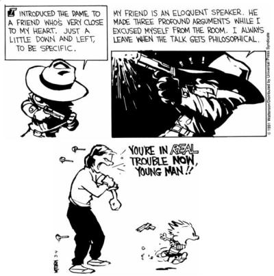


I am in absolute awe, especially because the fun he has doing this radiates from the work!
And I totally support the man in his decision to stop when he was done; to remain a private person and in his views on merchandizing and judging art. See wiki for the synops on that.
Watterson’s publisher
IN OTHER NEWS:
I’ve set up a reasoning to think my way out of feeling useless in life. I’m too tired now to present it to you, this art post took way longer than anticipated. But I will in the near future. At least before I lose my line of thought. Or can no longer read my scribbles…

(don’t bother, I took too poor a picture for you to read. Not on purpose though.)
Basically I first look at “being in existence”, if that yields any purpose. Animals, plants, bacteria, planets. (Nope. But a few interesting viewpoints to try out for fun.)
Then I look at “being human”. This yields results. I follow a few ways of looking at things: how judgement works; how values come into play; what is typical for humans and what is typical for me. This gives a few areas that require more investigation for me personally.
“Typical human” is then focused on some more. I divide it in having this brain and having emotions. Both give interesting clues for leading a purposeful life, as a human being.
Then there’re all kinds of overlaps and connections between intellect and emotion to discover. Quite fun to think about.
“Typical me” is concerned with how I roll (what fascinates me and what boundaries are sensible for me). This would differ for every individual. For me this will ask adaption and adoptation of mental attitudes. I’ll need to learn some new habits of how I look at the world, at life and at my days.